February 2026
12 Data-Backed Shifts Driving YouTube Growth in 2026 (and How to Apply Them)

Sami Kassir
Founder, Viewconomy
What’s actually working on YouTube right now (based on a huge dataset)
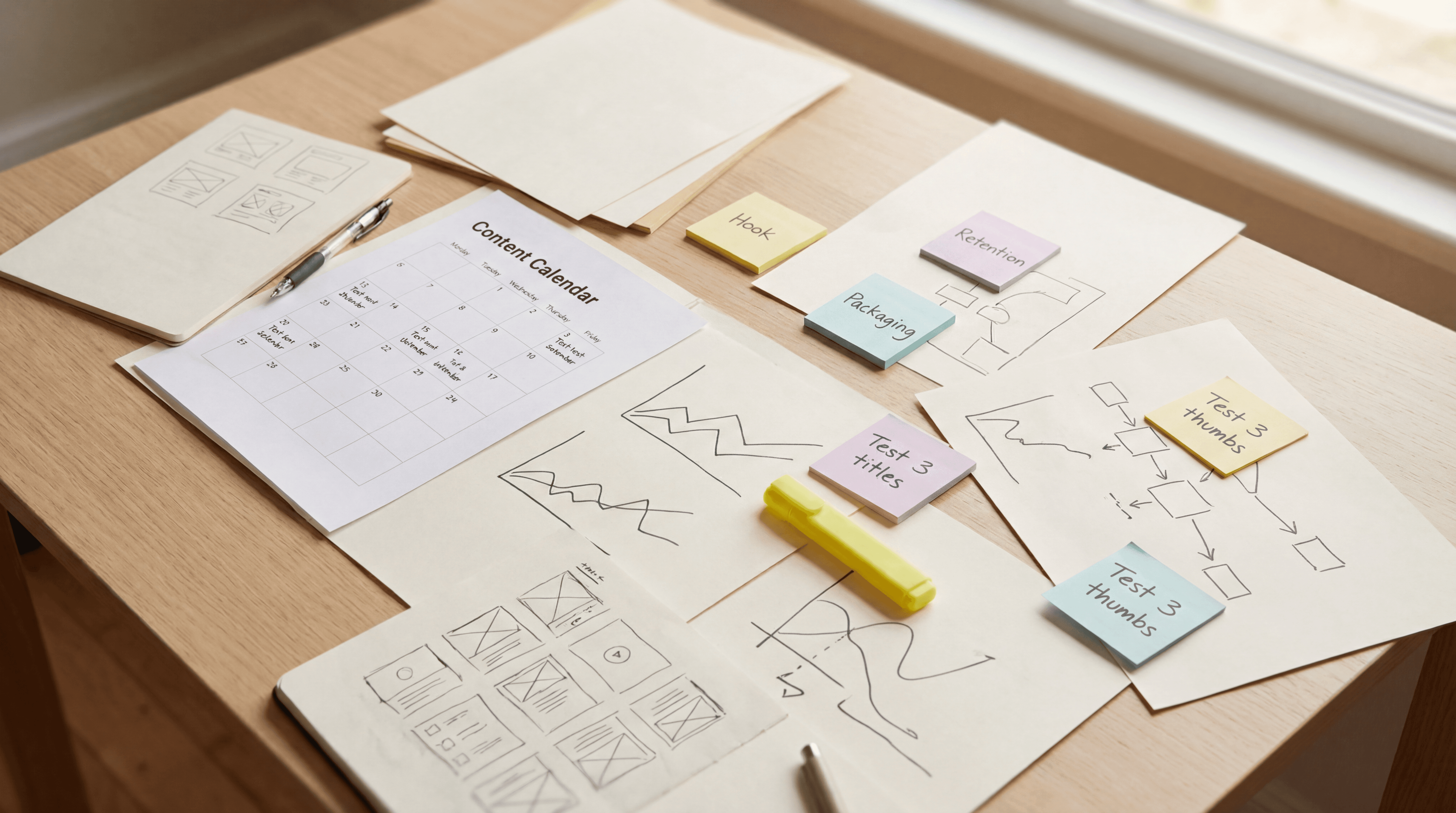
A recent large-scale analysis of tens of thousands of YouTube channels and hundreds of thousands of high-performing videos surfaced a set of patterns that keep showing up in 2026 winners.
This article summarises the most actionable takeaways from that discussion, without the fluff: video length, titles, thumbnails, emotions, and niche dynamics.
Important note: data reveals tendencies, not guarantees. The goal is not to blindly follow rules. The goal is to stack small, proven advantages so your ideas have a higher probability of breaking out.
Shift 1 and 2: Video length is polarising (and niche expectation matters)
1) If you’re under an hour, aim for roughly 15–25 minutes.
The analysis suggests a sweet spot in that range for videos under 60 minutes, with a weaker zone around roughly 30–60 minutes.
2) “Best length” depends on what the viewer expects in your niche.
Instead of asking “How long should my video be?”, the better question is: How long does my viewer expect this topic to be?
In practical terms:
Some niches tolerate longer “sit down and watch” content (commentary, entertainment, gaming, sports).
Some niches peak at shorter to mid-length (food, DIY, tutorial-style content).
Takeaway: match your structure to the expectation, then earn the right to go longer.
Shift 3 and 4: Titles should be shorter than you think (and numbers don’t help)
3) Title length sweet spot: roughly 5–8 words.
Shorter titles tend to win because they reduce friction. People click fast. Every extra word increases “mental load.”
4) Numbers in titles are not a cheat code.
Across the dataset, titles without numbers performed better on average. Numbers signal “list/tutorial structure,” which can feel more like work than curiosity.
This does not mean “never use numbers.” If the number is part of the story, it can be worth it. The point is: don’t assume numbers automatically boost clicks.
What to do instead:
Strip your title down until it reads like a punch.
Prioritise emotion + clarity over explanation.
Make sure it won’t get cut off on smaller displays.
Shift 5–8: Thumbnails are simpler in 2026 (bright, minimal text, strong colour choices) - Shift 9–12: Emotion, negativity, and niche selection (virality isn’t random)
5) Faces in thumbnails: surprisingly small difference overall.
Performance varies by niche. In some categories, faces can add trust. In others, the topic or visual concept carries the click. The bigger point is: don’t treat “face vs no face” as the main lever.
6) Thumbnail text generally hurts performance.
Thumbnails with no text tended to outperform. If you use text, keep it extremely minimal. The image should communicate the idea. The title can do the labelling.
7) Brighter thumbnails get clicked more.
Dark thumbnails get skipped. Brightness helps your video “pop” in the feed.
8) Certain colours tend to perform better.
The analysis suggested that high-visibility colours (think cyan/green/yellow/orange) often over-index, likely because they contrast well against YouTube’s typical UI and compressed thumbnails.
Takeaway: thumbnails are moving toward clarity over complexity. Show the idea. Reduce clutter. Increase contrast.
9) Emotion drives clicks more than structure.
The study highlighted that humour/joy performs strongly, with controversy/anger/fear also ranking highly. This doesn’t mean you should become negative. It means your packaging must make someone feel something.
10) Negative framing often outperforms positive framing.
Negative titles can create tension and urgency. Neutral is safe. Negative is clickable. You can use this without becoming “doom content” by staying honest and delivering in the video.
11) Some niches have an easier breakout curve.
Categories with high baseline demand + constant external trends + high outlier potential tend to produce more breakout videos (think topics like movies/TV, music, sports, plus other trend-rich categories).
12) The biggest mistake: copying norms instead of copying what works.
A lot of creators optimise for what’s easiest to control (like adding text to thumbnails because “everyone does it”) rather than what the data suggests drives performance.
The common thread across the insights is simple:
Lower cognitive load wins.
Shorter titles. Cleaner thumbnails. Easier-to-grasp concepts. Less work for the viewer.